There's something odd about that cityscape. That was my reaction as I looked at the poster advertising the launch of a TV channel which has exclusive first-look access to all HBO's output. The idea of merging the New York buildings into the London skyline is understandable, but the choices are odd and the effect dis-easing.
I may be wrong but it seems that they've only used New York buildings - that is the South Street Seaport isn't it? So, firstly, they're projecting New York rather than the USA even though not all the shows are New York-based. Moreover, the majority of the office blocks are, to me at least, anonymous. They're neither specifically New York or London or, indeed, specifically American or British.
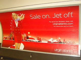
The overall impression is that of a quasi-generic cityscape - you know what it wants to be but it's not quite there and it's proximity to reality is unnerving. In robotics this is known as the uncanny valley but I think it can be applied here too. Especially, as my attention was drawn to the poster right next to it in the Tube station.
The theme is similar, but they don't try to be overly subtle and the result feels much better to me and gets the job done.
Despite what I heard a panel of creative director assert recently - it's not art it's marketing. It can and often should be artistic, but only when that doesn't get in the way of its purpose.
Thursday, January 20, 2011
The Uncanny Cityscape.
9:09 AM
No comments
Subscribe to:
Post Comments (Atom)


0 comments:
Post a Comment